Need some inspiration when using online form builders? In this article, we'll share creative multi-step form examples that help increase lead generation on your website.
In today’s digital age, it is getting increasingly harder to keep the attention of our customers. 60% of the global population has access to the internet, and 92% of that number uses the internet via their mobile devices.
With this type of accessibility at consumers’ fingertips, they have an array of options for how to use their time.

Filling out a long form of information… Probably not one of their top options.
However, bite-sized pieces and a bit of fun can hold the attention of your consumers long enough for you to get the information you need.
Remember to get imaginative in asking for user information.
We’ll help you figure out your next multi-step form by showing you some fascinating design elements of multi-step forms that boost lead conversions.
What is a multi-step form?
Before we see the best of the best multi-step forms examples for different industries, you might be asking what a multi-step form actually is.
Multi-step forms break up long web forms into multiple views or steps to make forms less overwhelming and easier to complete.
Both B2B and B2C companies can use multi-step forms tactically to qualify and collect quality leads.
Why are multi-step forms better than single-step forms?
What makes multi-step forms better than single-step forms?
Well think back to school test day and the teacher hands you a test that's miles long. You stare into the abyss, right?
Well, when a visitor sees a long single-page form on your website it can give the same feeling and they may feel inclined to click out.
Lengthy single-step forms that require different types of information often repel website visitors for a few reasons. There may be fields on the form the user doesn’t know the information for right away, thus discouraging them to fill out the form at all.
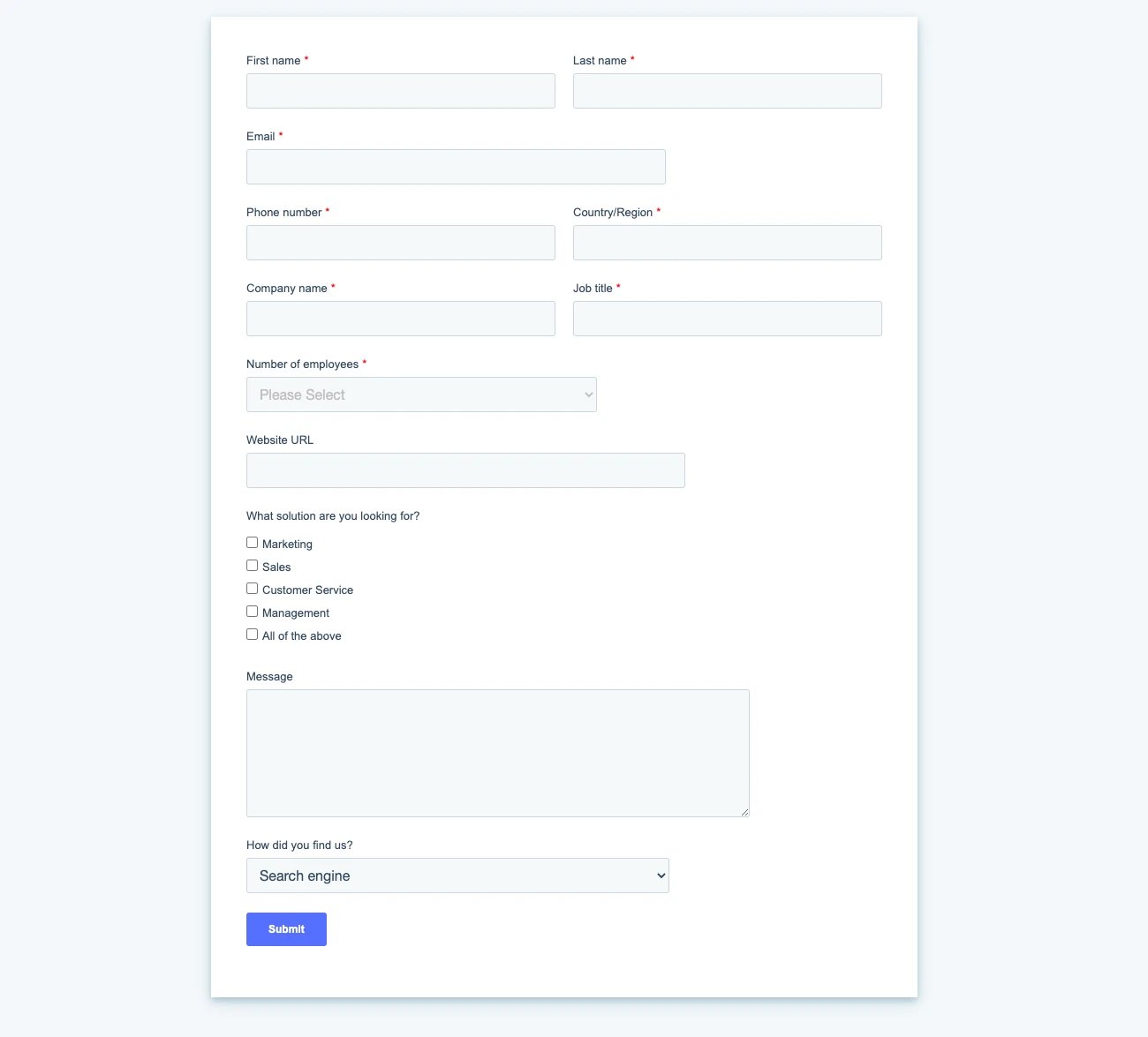
Also, long single-step forms look like a lengthy time commitment for the user when he sees 8+ fields that need to be completed on the form
Reducing the number of form fields available to the user even just from 4 to 3 for example increases conversion rates by nearly 50%.
The way to reduce form fields is by splitting the form into multiple views; this is where multi-step forms come in.
Multi-step forms provide a way for your customers to answer the questions you need in an engaging, digestible way.
Of course, there are cases when a single-step form is a better fit.
An example of this situation could be when you only need one category of information from your user, like contact information.
In this example, there’s no need to lengthen the process by adding multiple steps.
Key benefits of multi-step forms
To summarise, some of the key benefits multi-step forms bring to your sales and marketing teams are that they:
- Grow lead conversion rates
- Qualify leads for sales teams
- Promote an engaging, user-friendly experience
- Are fully customisable and help promote brand awareness
Multi-step form examples for different industries
Let's go through some examples that are the “creme de la creme” when it comes to personalising and engaging multistep forms. These will give you some inspiration while you are designing on the online builder.
Best multi-step form example for B2B companies
Let’s start out with the best example…of course, we think our giosg multi-step forms are the best since our marketers know a thing or two about lead generation.
When one of our lovely readers, like you, land on our blog posts, you will notice at the bottom a little message pops up.

A good strategy to use in the first step of a multi-step form is to entice your customers with free offers.
Who doesn’t like free things, right?
Even better, go against the grain and offer downloadable content without requiring an email address.
Giving something for free without asking for an email address can help build trust with your customers.
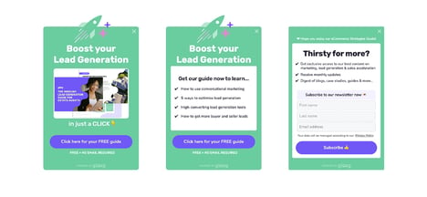
Then, in the second or third step of your form, you can let your customers know that you have more exciting content that they can consume.
Provide form fields to collect the visitor’s name and email address to add them to your subscriber list.
Best multi-step form example for car dealerships
Here is an example of an exceptional multi-step form that demonstrates value for your customers and your business.
In this multi-step form example used by a car dealership, customers are first attracted to the form with a simple “How may I help you?”
Once clicked, the first view of this form, customers are instantly segmented based on the service they need.
This also provides valuable information for you as it organises the topic of queries which tells you the services/products they are most interested in.
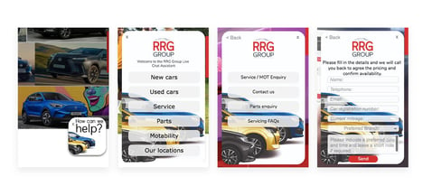
Once the appropriate buttons are clicked which guides the website visitor to their desired destination, the final step is collecting the relevant information with form fields.
A multi-step form example like this one is helpful for car dealerships because it segments your queries in a logical way.
For customers, it reassures them that they will receive the best level of service from the right person since there were categories that matched their needs.
For your business, a form like this reduces the number of inquiries that require personal attention in your live chat or email.
When your forms are organised with qualifying questions before the form, it also saves you the hassle of having to ask for additional information.
Best multi-step form examples for e-commerce
This next example knocks it out of the park for being innovative and fun.
Bonti, a retailer to the Royals is based in Sweden and sell all things baby and kids. They found a way to help new parents’ put their minds at ease when it comes to buying high-value products.
They launched a delightful quiz to help parents understand what kind of stroller is best for them.
The first step of the quiz starts by asking for the visitor’s email. For the visitors, this means they can choose to share their email for different offers and discounts. For your retail store, it's a great way to be able to retarget your customers later.
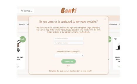
Here, an email is not a requirement to continue with the quiz. As mentioned earlier, this builds trust with the customer that you are willing to provide them beneficial information without wanting something in return.
Perhaps down the line, like at checkout, they will gladly share this information with you when asked again.
After this initial step, the quiz continues to ask unique questions that help the user in finding the perfect stroller. For example, some of those questions include, “Do you live in an apartment or house? Does your apartment have an elevator? Etc.”

These are great questions to ask to give the user confidence in their purchase, and it gives you as a retailer crucial information on how to retarget ads and offers to specific users later.
Get started with multi-step forms
When designed thoughtfully, multi-step forms help increase brand awareness, engagement, and lead capture.
They are seen as both engaging and fun for the consumer, but it is also a great tool to have in your pocket when third-party cookies are a thing of the past and you need to start collecting details directly from your consumers.
Equip your business with an easy to use, no-code form builder from giosg and let that creativity flag fly.
Book a quick demo with us and see how to create multi-step forms that attract potential customers left and right!