Building up revenue starts with acquiring traffic to your website. But how do you convert that traffic into revenue?
You've improved SEO, mastered paid advertising, and leveraged social media so you may think now that visitors start coming to the website, the sales are coming next.
Well, you have the right idea, but you need to do a little more to prevent visitors from closing the website immediately or exiting after clicking on several other pages.
If you see low conversions and high bounce rates on product pages, you should pay attention to a few different aspects, one being user-friendliness.
This article will analyse the radiant product pages of some eCommerce websites and the elements on their pages that boost conversions.
Product Page Tips to Convert More Visitors into Customers
1. Cross-Selling Products at Maude
Cross-selling is offering related goods to prospects to encourage more sales. An essential thing about cross-selling is to not be too pushy. Consumers don’t mind looking at additional products but hate being pressured.
For example, instead of saying “We Recommend”, you can say “Products that might interest you.” Though sharing the same meaning, the second phrase lets the shopper choose while the first one imposes your opinion.
Some eCommerce websites step their game up a few levels by making neat builders that suggest entire looks. Cross-selling builders are a big “yes”. Think of them as the polished mannequins wearing awesome outfits in brick-and-mortar shops. Or you can display best sellers to convince buyers to test what many other people like.
There are several ways to configure cross-sell blocks:
- at the bottom of the page;
- on a confirmation message appearing after placing a product in the cart;
- on a website pop-up that shows the items in the cart
Check the Maude shop in the screenshot below. After clicking the “Add to Cart” button, a pop-up appears with a subtle hint to put popular items to the cart. Note that visitors stay on the same product page.
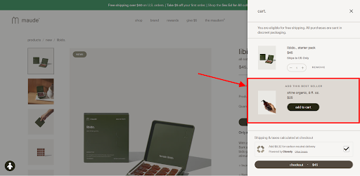
Image via Maude website
This adds interactivity, user engagement, and value to your online business by helping your customers find complimentary items.
2. Offering Personalised Guides with giosg
Why not provide your online clients with personal assistance as if they came to a physical shop?
You could do this by using guides or quizzes to help visitors choose sizes, styles, models, and colours. Such functionality will allow you to collect valuable client data and guide consumers in making purchasing decisions.
Let’s see how such a quiz works with this example from giosg. Visitors need to answer a series of questions about their upcoming road trip:
- type of car they drive;
- weight of items they want to bring;
- hobbies they often partake in;
At the end of the quiz, shoppers have the option to enter their age, name, and email to receive more personalised recommendations later. After the quiz. people can immediately add products to the cart and place an order.
Implementing this kind of functionality will certainly make consumers appreciate your care, and you’ll be delighted with the increase in sales. It’s also a great way to collect personal data from the target audience.
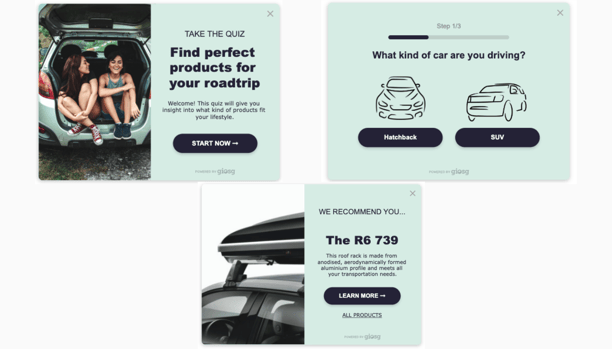
Image via giosg Interaction Builder
3. Converting with Calls to Action at Lara Intimates
What is the easiest way to increase conversions? By tell people what to do. Format such instructions as buttons, directing buyers to the desired spot in your conversion funnel. Specify what visitors will see when clicking on this or that link.
Calls to action contain such words as “buy”, “sign up”, etc. The main thing is to place CTAs on the right pages to fit the context and extend the buyer’s intent.
For example, place CTAs on a blog to subscribe to an email newsletter or download educational materials. Product pages should allow visitors to add goods to a wish list/cart or instantly pay through a convenient CTA.
You can’t tell for sure which wording, colour, or placement will convert better. But there are specific rules CTAs should follow.
- Personalise it to increase the chance of conversion by 202%.
- Run regular A/B tests to discover what works or needs improvement as customer preferences constantly change. Tweak button colours, placement, sizes, and shapes.
- Try colours outside of your branding palette. It will make buttons easier to spot.
Look at how the Lara Intimates online shop utilises CTAs on its product page. The primary CTA to buy an item is the most visible button on the page and has a brighter colour. To give it more prominence, the retailer leverages a sense of scarcity and urgency with the message “only 1 item in stock”).
There is also a CTA to buy a product straight away on the next line of the hierarchy. Below that is a more discreet button to add the goods to the wish list.
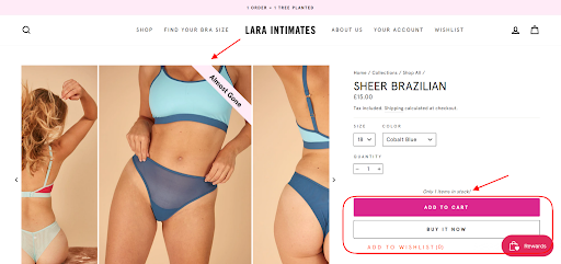
Image via Lara Intimates
4. Helping Visitors with Chatbots Powered by giosg
The option to ask questions and get answers is essential when deciding on a purchase. Imagine shoppers need some information. If there are no buttons to help customers find information on the product page, they start scrolling and clicking aimlessly.
They’ll forget about the product or decide not to purchase it. Because the more clicks consumers make, the lower their purchase intent becomes. Not to mention how irritated they get with the lack of information on the website.
That’s where live chat comes to your aid. Chat options may appear at the top or bottom of the page and connect you with a shop representative.
Implementing automated chatbots and live chat options is a great idea for providing top-notch service during and after work hours.
AI-powered chatbot systems mimic human communication and provide instant responses, correct information, and uninterrupted work. Chatbots need no rest. They have no holidays.
The best part is that modern chatbots are hard to distinguish from people as they decipher emotions and context. They can learn from previous experiences and enhance with time. As a result, you improve the customer service and let people focus on more complex tasks.
You can check such an example in the screenshot from Ruohonjuuri below. The chatbot greets prospects and lets them choose the way of interaction:
- by clicking on the menu options and selecting a topic
- messaging customer service
.png?width=603&name=product%20page%20chat%20(1).png)
Image via ruohonjuuri
5. Using Shoppable Videos
Videos are the most engaging content for your eCommerce business. According to Wyzowl, this type of content assisted in generating leads for 84% of video marketers. Videos also improve website metrics by increasing time spent on the page.
Videos let you present products from all angles, reveal exclusive scenes, and accompany the picture with your vocal narration. Turning these product videos into shoppable videos can also lead to direct sales. With giosg Interaction Builder, you can do it with a couple of easy clicks. This is a low key option to use videos to boost sales on your website.
Alternatively, major platforms like Instagram, YouTube, and TikTok understand the power of videos for marketing and sales. As a result, they enable shoppable tags. Such links appear on the recording and let consumers buy without going to another website. They provide the following benefits:
- more interactive videos and higher engagement;
- better conversions as customers need to make fewer clicks;
- flawless user experiences, ensuring customer satisfaction and loyalty.
How do you start a video marketing campaign? Prepare the place, program, and yourself. Don’t forget that the work doesn’t finish after publishing the video. Maximise the potential of your content, repurpose it, and use it multiple times.
Let’s take the Kate Spade New York Instagram account. The brand leverages shoppable videos, as seen in the screenshot below. You can click the “View products” button to see a pop-up with an attached item. It’s possible to continue shopping, scroll other goods, or proceed to the website to buy products.
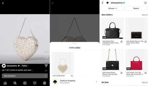 Image via Kate Spade Instagram
6. Providing Social Proof at Once Upon a Farm
Once prospects find the needed products, they often start investigating further.
How does it look in real life? Does it match the description?
At this stage, it is essential to demonstrate to the client that other buyers have already tried this product and found some advantages or disadvantages. This is called social proof.
These can be reviews, testimonials, case studies, and social media activities. Anything that highlights that your business is popular among crowds. Dermeleve went even further by placing testimonials from real experts on their homepage to make their social proof even stronger.
The truth is, it’s easy to accumulate if you have loyal customers. Begin with asking them for reviews, ratings, photos, or videos. You can send emails or set up autoresponders when buyers finish the order.
Display user-generated content in the dedicated section of the online shop. Appreciate the spent time and reward it with discounts, bonuses, or social media mentions.
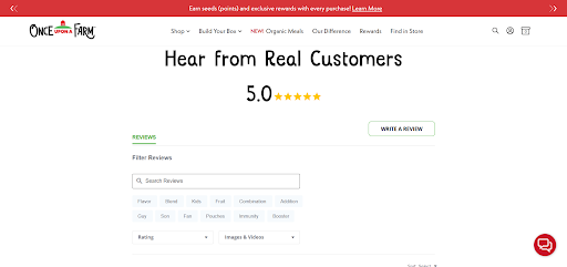
Once Upon a Farm combines several ways to strengthen its brand credibility. The first is the home page containing the section connected to the Instagram account. You can see the company’s posts and its devoted audience’s photos.
But let’s also consider the second option to gain trust: reviews. The review section is easy to navigate and provides several filter options. You can search for specific feedback, click on the suggested keywords, and sort the comments by ratings or visual accompaniment.
To Sum Up
Every business faces tough competition in the market, making sure your product pages entice and inform website visitors is a great place to start standing out.
In addition to your product pages, you can boost your website ranking by building links from other resources or launching paid ads. The only way to stand out is to provide consumers with a unique shopping experience.
A case in point is personalisation. You won’t achieve the desired results without personalisation and will soon find yourself out of the game. That’s why it’s worth starting to create personalised guides and recommendations today. Other converting tips include:
- presenting the most relevant products to customers to complement the order;
- assisting them even before the problem arises with chatbots;
- placing CTAs to direct to the needed pages;
- showing other buyers’ opinions.
- Following other shopping cart UX best practices
Try tweaking and adding something step by step. As a result, you’ll improve not just conversions but also other key website metrics and build a successful business.